
Calyx
For brands that sell what's inside.
The most important design on the bottle is the one nobody can read.
Supplement brands spend months on a formula: how much of each ingredient, in which form, and why it is there at all. Then the store shows it as a photo of the back of the bottle, too small to read on a phone and invisible to search.
We wanted a store that starts from the label instead. Calyx sets every formula as real type, the way a printer sets a Supplement Facts panel, and builds the rest of the store around it.
Supplements, functional nutrition, clinical skincare and functional drinks, with 2 to 10 products.
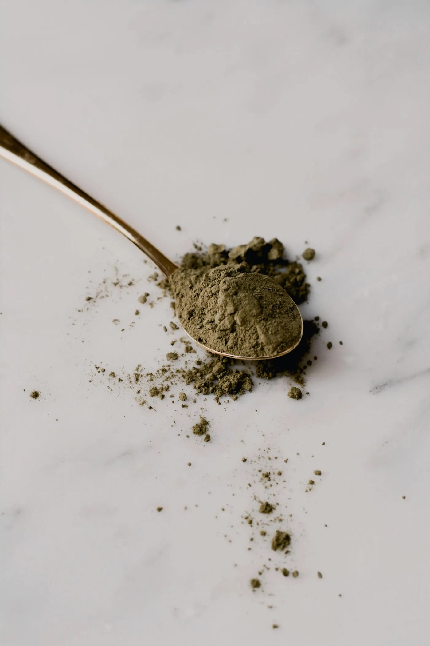
Honesty is a design decision.
A calyx is the ring of leaves that holds a flower before it opens.
It protects what is inside and shows its shape. That became the job of the theme: hold the formula, and show it plainly.
Everything else follows from that. Nothing on the page competes with what is in the product.
Chalk, elderberry and turmeric.
A quiet chalk ground, an ink the color of elderberry, and one warm turmeric accent for the things that matter. Chivo for its blunt, printed honesty. Alegreya italic for the Latin names, like the labels in a herbarium.
Every product gets its own color and its own hour of the day, so a routine becomes something you can see.
The label, everywhere it matters.
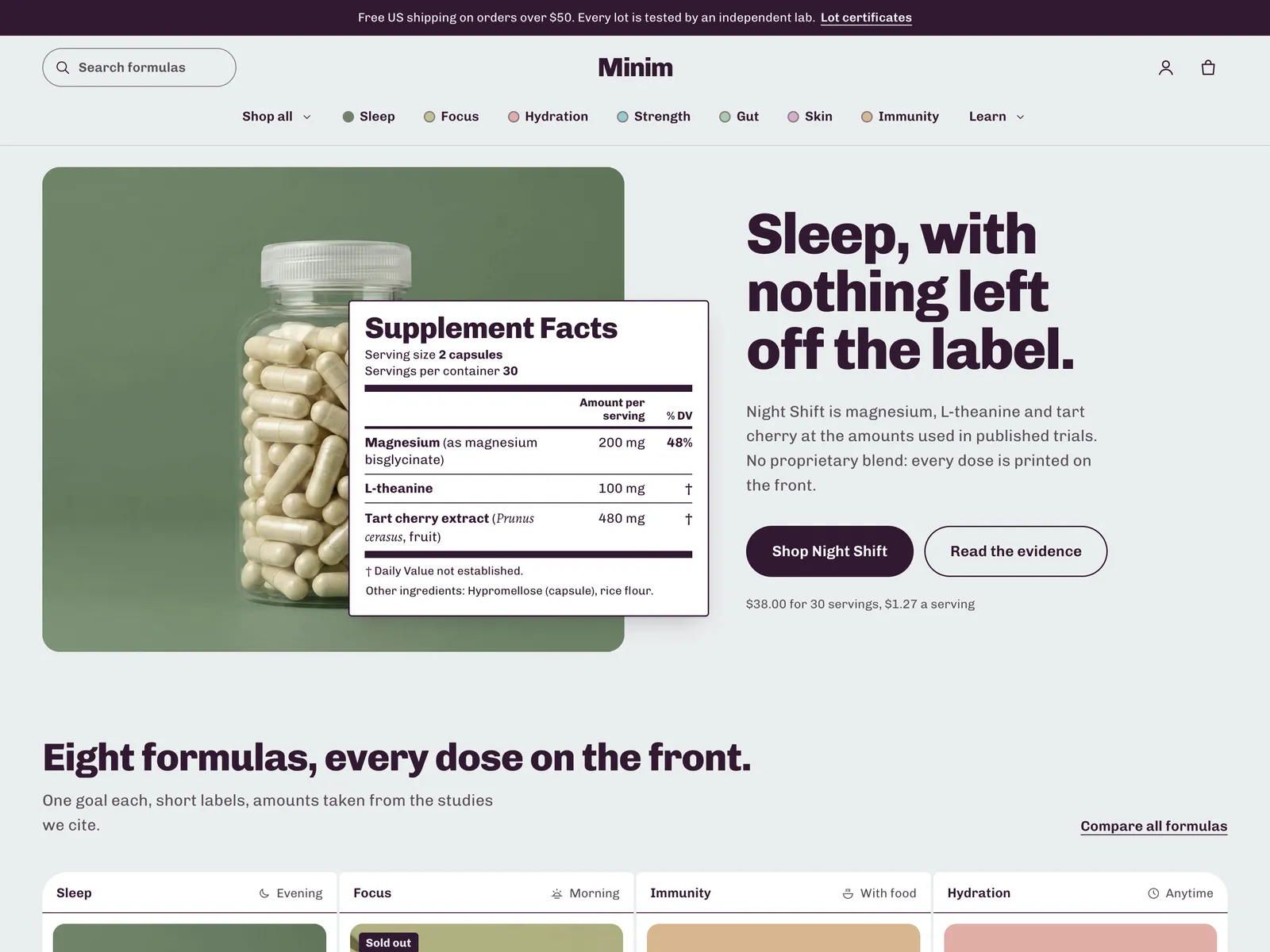
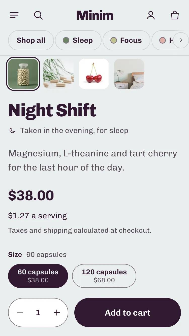
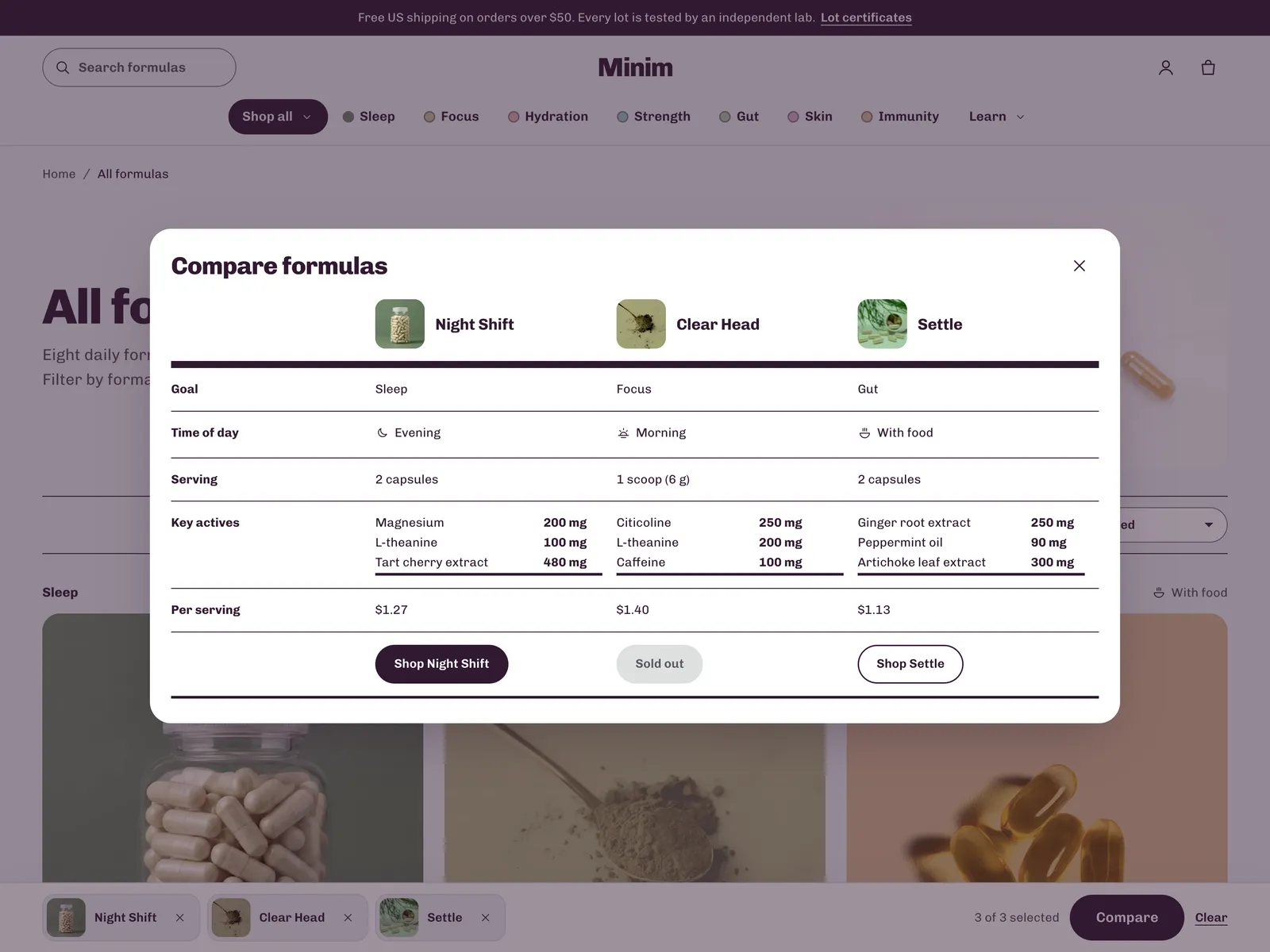
The label is a real table.
Read aloud row by row, never a photo of text.
- Audit
- Every page type, desktop and phone.
- Contrast
- 4.5:1 text, 3:1 controls, in every color scheme.
One style to start. Two more on the way.
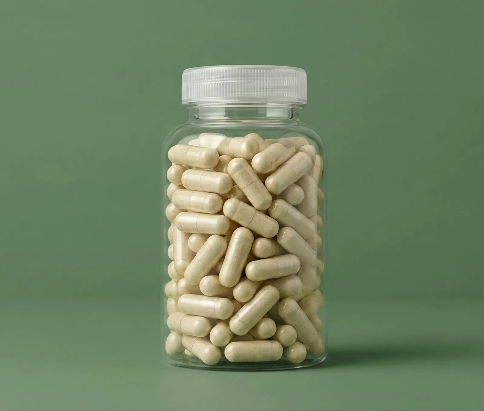
Supplement Facts on chalk, for a small range of formulas.
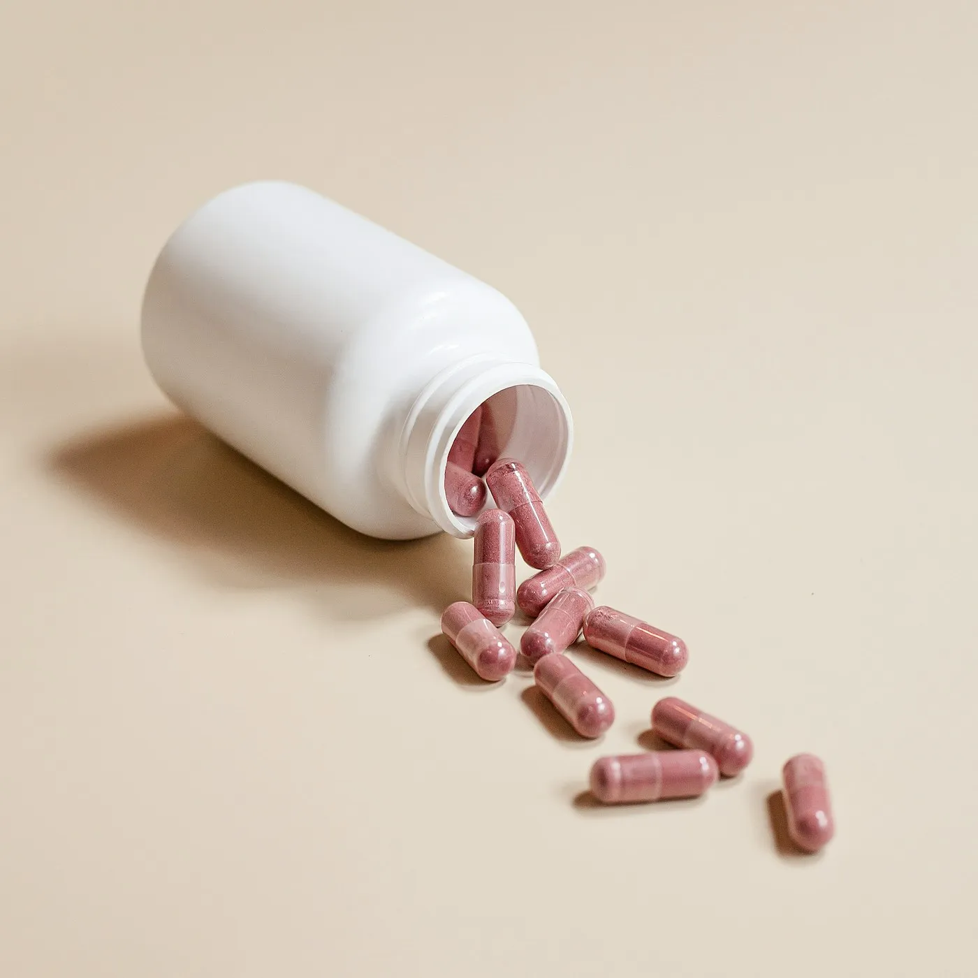
Key actives in percent, for clinical skincare.
One product, a long ingredient list, and a reason for every amount.
